

The best backsplash for gray cabinets is not one tile. It is the tile that matches the cabinet undertone first, then the countertop, then the amount of contrast you want. A good backsplash for gray kitchen cabinets usually lands in one of six safe families: warm white, soft greige, marble-look, stone-look, handmade-look glossy tile, or a restrained tonal gray with enough texture to keep the kitchen from looking flat.
White subway tile still works, but it is not automatic. With cool gray cabinets and stark white counters, it can read crisp and clean. With dim light and no warm finishes, it can feel cold or builder-basic. If you want the best backsplash for gray cabinets, treat this as a matching decision, not a trend decision.
Best backsplash for gray cabinets: quick answer and top combinations
Warm white tile is the safest choice when you want a kitchen backsplash for gray cabinets that feels bright but not stark. Warm whites, soft ivories, and off-whites balance gray without fighting it, and they work especially well when the cabinets lean cool or the room gets limited natural light.
Soft greige and stone-look tile are usually the easiest way to make grey cabinets feel warmer. These tones bridge warm and cool finishes, which matters when your kitchen has mixed elements like white quartz, oak flooring, and brushed brass hardware.
Marble-look tile works best when you want a timeless finish with some movement. The gray veining ties into the cabinets, while the white field keeps the wall lighter than the millwork. It is a strong choice for homeowners comparing a white backsplash for gray kitchen cabinets but wanting more depth than plain subway.
Handmade-look or zellige-style tile suits gray cabinetry when the kitchen needs texture and reflection. The slight variation in surface and tone helps a gray kitchen feel layered instead of flat, especially in smaller Toronto kitchens where light bounce matters.
Tonal gray can work, but only with visible variation in finish, pattern, or grout. A backsplash for grey cabinets that exactly matches the cabinet colour usually falls flat unless the tile brings gloss, relief, or scale contrast.
How to choose a backsplash for gray cabinets: a 4-step decision framework
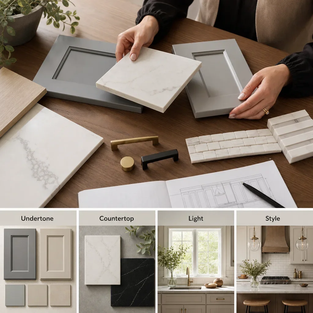
Start with undertone, because gray is rarely just gray. Cabinets usually read as warm gray, cool gray, blue-gray, charcoal, or greige, and that undertone tells you whether your backsplash should lean creamy, crisp, earthy, or smoky.
Match the countertop second, because the counter and backsplash sit edge to edge. Plain white quartz can handle more tile texture, marble-look quartz usually needs calmer backsplash movement, black counters usually benefit from a lighter wall finish, and butcher block can support cooler tile because the wood already adds warmth.
Use natural light and room size to set contrast. Bright kitchens can carry stronger pattern or deeper tile, while smaller or darker kitchens usually benefit from lighter, more reflective surfaces that keep the cabinet line from feeling heavy.
Choose style direction last so the design stays coordinated. Timeless kitchens usually suit warm white subway, soft stone-look tile, or marble-look finishes, while a modern backsplash for gray kitchen cabinets often uses stacked layouts, larger formats, slab runs, or lower-contrast grout.
Follow one simple rule if you feel stuck: match undertone first, choose contrast second, and choose pattern scale third. That order avoids the most common mistake, which is falling in love with a tile sample that looks good alone but clashes once it sits beside the cabinet door and countertop.
Comparison table: best backsplash options by gray cabinet shade
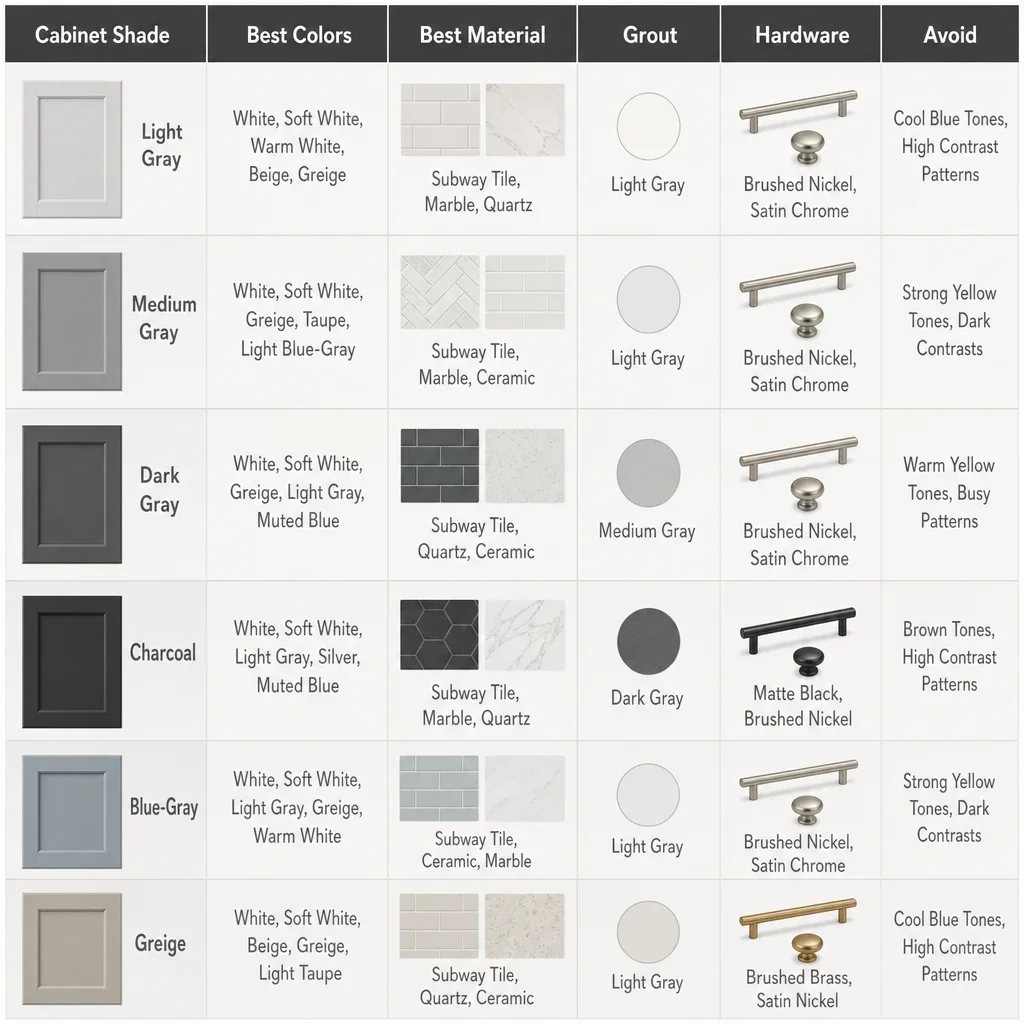
The right backsplash for light grey cabinets is different from the right tile for charcoal or blue-gray cabinetry. This table gives you the practical pairings.
| Cabinet shade | Best backsplash colours | Best materials | Best grout direction | Best hardware pairing | What to avoid |
|---|---|---|---|---|---|
| Light gray | Warm white, soft greige, pale marble-look | Ceramic, porcelain, marble-look porcelain, glossy handmade-look tile | Light greige or soft gray for a blended look | Brushed nickel, brass, matte black depending on warmth | Stark icy white in a dim room |
| Medium gray | Warm white, taupe, marble white, muted greige | Porcelain subway, picket, stone-look porcelain | Blend grout unless you want more pattern | Brass for warmth, black for contrast | Busy tile with busy counters |
| Dark gray | Off-white, creamy white, light stone, marble-look | Porcelain, slab, larger-format tile | Light grout to keep the wall lifted | Brass, black, stainless | Dark backsplash with dark counters unless the room is bright |
| Charcoal | Warm white, soft beige-greige, restrained veining | Large-format porcelain, slab, glossy ceramic | Low-contrast light grout | Brass or lighter metal for lift | Exact-match charcoal tile with no texture |
| Blue-gray | Soft white, warm white, pale greige, muted blue-green in select styles | Handmade-look ceramic, porcelain, marble-look | Soft gray or warm white depending on tile body | Chrome, brushed nickel, aged brass | Yellow-beige that fights the blue undertone |
| Greige | Warm white, taupe, limestone-look, creamy marble | Stone-look porcelain, ceramic subway, textured tile | Greige grout works well | Brass, bronze, black | Cold icy whites that make the cabinets look muddy |
This table is design guidance, not a fixed rule. The best backsplash for grey kitchen cabinets still depends on the room’s lighting, the counter pattern, and whether you want a safer resale-friendly look or a more design-forward one.
Should backsplash be lighter or darker than gray cabinets?
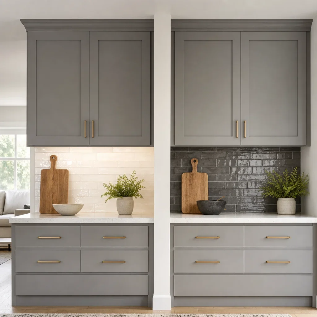
Lighter is usually the safer choice, especially with medium to dark cabinetry. A lighter backsplash separates the wall from the cabinet run, reflects more light, and keeps the kitchen from feeling too dense.
Darker can work when the kitchen is large, bright, and intentionally dramatic. If you already have contrast from white counters or open shelving, a deeper backsplash can look tailored instead of heavy.
Gray-on-gray works best when the contrast comes from finish rather than colour. Matte cabinets paired with glossy tile, flat shaker doors paired with handmade tile, or plain fronts paired with veining or relief can keep the space from blending into one block.
Small kitchens usually benefit from a backsplash that is lighter than the cabinets. Large kitchens can handle darker or more tonal decisions because there is more visual breathing room across the room.
Best backsplash colours for gray cabinets
Warm white is the most reliable answer when people ask what color backsplash goes with gray cabinets. It brightens the room without pushing the cabinets colder, and it works with both contemporary and transitional kitchens.
Creamy white and off-white are better than stark white when the gray has a cool cast. They soften the contrast and make the kitchen feel less clinical, which matters if you also have polished counters and stainless appliances.
Greige, taupe, and soft beige are the strongest warming colours for grey cabinets. They suit homeowners asking what color backsplash goes well with grey cabinets when the kitchen feels a little flat or cold.
Marble white with gray veining is a safe bridge between crisp and warm. It works especially well when you want a white backsplash for grey kitchen cabinets but need more movement than a plain field tile.
Muted green, blue-gray, and earthy clay-adjacent tones can work as accent colours, but only when the cabinet undertone supports them. Cool gray cabinets usually suit dusty blue-green better than yellow-green, while warmer grays can handle softer earthy tones.
Highly icy whites can make a gray kitchen feel cold if nothing else adds warmth. Wood stools, oak shelves, warm LEDs, brass hardware, or warmer grout can correct that balance.
Backsplash ideas by material and tile type
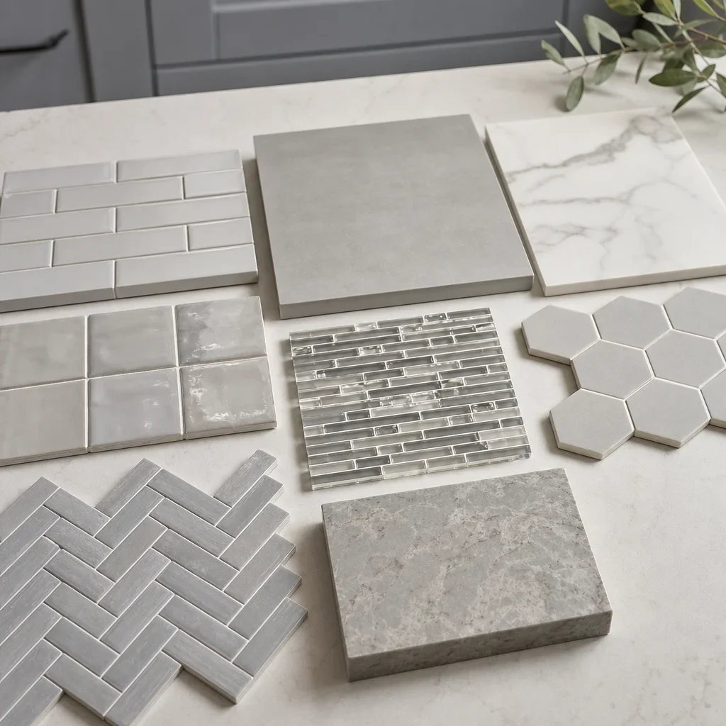
Ceramic subway tile is the easiest classic option for a backsplash for gray kitchen cabinets. It suits traditional, transitional, and many modern kitchens, and it gives you a wide range of whites, greiges, and grout looks without a high-maintenance surface.
Porcelain tile is one of the most practical materials for busy kitchens. It can mimic marble, limestone, terrazzo, or concrete, and it usually gives you better stain resistance and lower maintenance than natural stone.
Natural marble looks refined with gray cabinets, but it needs more care than porcelain. Stone can etch or stain more easily, and some products may require sealing, so you should confirm care requirements with the manufacturer and installer before choosing it.
Zellige-style or handmade-look tile adds warmth through variation. This is one of the best backsplash ideas for grey kitchen cabinets when the room needs texture, a little gloss, and a less uniform finish.
Glass mosaic reflects light well, but it can read busier because of the number of grout joints. It suits some compact kitchens, though homeowners wanting a quieter look often prefer larger tile with fewer lines.
Hexagon, herringbone, picket, and basketweave patterns change the style more than the colour does. Subway is calmer, herringbone feels more decorative, vertical stack feels more modern, and picket gives a custom look without a loud colour choice.
Full slab backsplash is the cleanest modern option if you want very few joints. It pairs especially well with flat-panel gray cabinets and can make a kitchen look more architectural, though material and fabrication choices matter to the budget.
Matte tile hides smudges differently than glossy tile, while glossy tile throws more light back into the room. That means finish matters as much as colour when you are trying to warm up a kitchen with gray cabinets.
What backsplash works with gray cabinets and white, black, wood, or patterned countertops?
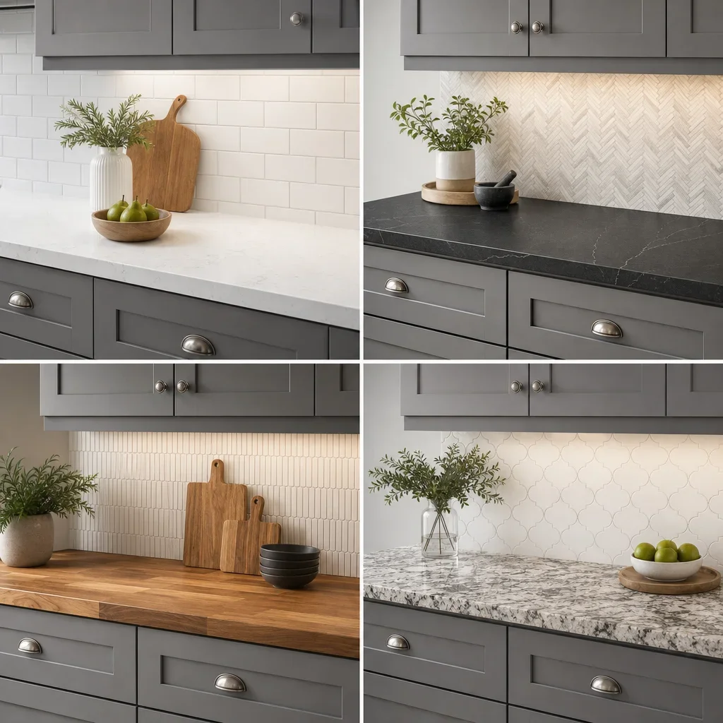
White quartz works well with warm white, soft greige, or subtle marble-look tile. If the quartz is plain and bright, the backsplash can carry a little more texture because the countertop itself is visually quiet.
Marble-look quartz usually needs a backsplash with less movement than the counter. If both surfaces have strong veining, they compete, and the kitchen starts to look busy instead of tailored.
Black countertops usually look better with a lighter backsplash. That lift is important when you are choosing a backsplash for gray cabinets and black countertops, because the cabinets already sit in the middle-to-dark range.
Granite with lots of movement usually calls for a simpler backsplash. A calm ceramic or porcelain tile in one dominant colour prevents the wall from fighting the pattern already happening on the counter.
Butcher block or wood counters can carry cooler tile because the wood supplies warmth naturally. This pairing works well when you want a modern backsplash for grey kitchen cabinets without making the room feel sterile.
Laminate counters usually look best with straightforward tile choices. Clean subway, simple stacked layouts, and restrained grout lines tend to look more intentional than ornate shapes beside a budget-conscious countertop.
Countertop pairing matrix
| Countertop type | Best backsplash direction | Why it works | Watch out for |
|---|---|---|---|
| Plain white quartz | Warm white, greige, handmade-look, subtle marble-look | The counter is quiet, so the backsplash can add texture | Stark white on cool gray can feel cold |
| Marble-look quartz | Simple white or greige tile with low movement | Lets the counter stay the feature | Competing veining |
| Black stone | Light warm white or soft stone-look | Balances the dark surface | Going too dark above the counter |
| Busy granite | Simple colour, restrained shape | Calms the composition | Pattern fighting pattern |
| Butcher block | Crisp white, blue-gray, or soft greige | Wood warms the scheme | Yellow-beige with cool gray cabinets |
| Laminate | Clean ceramic or porcelain, simple layout | Keeps the update looking intentional | Overly ornate tile shapes |
How to add warmth to a grey kitchen
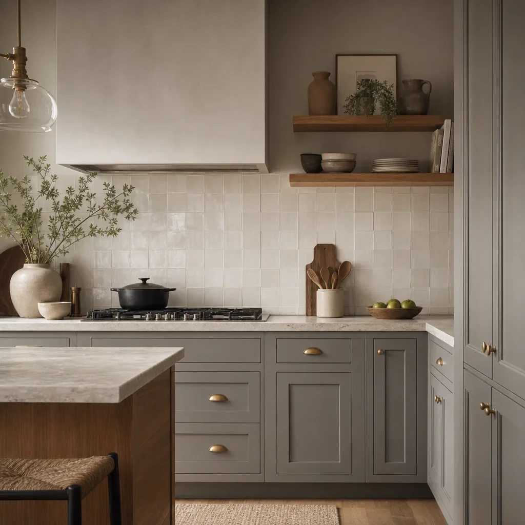
Warmth comes from colour temperature, texture, and finish, not from one element alone. The easiest backsplash move is to shift from icy white to warm white, creamy white, soft greige, or a handmade-look glaze.
Texture helps gray cabinets look less boring because it adds shadow and movement. Glossy uneven tile, stone-look porcelain, or subtle relief patterns make the backsplash feel layered even when the colour palette stays restrained.
Wood accents are one of the strongest balancing tools for a cool gray kitchen. Oak shelving, walnut stools, butcher block, or even warmer flooring can support a crisper backsplash without letting the room feel cold.
Warm metals also change how gray reads. Brass and aged gold can make cool cabinets feel softer, while stainless and chrome usually keep the kitchen more crisp and contemporary.
Lighting matters as much as tile colour. Warmer interior lighting can pull the sharpness out of cool gray finishes, while very cool lighting can make an already gray-heavy kitchen feel flat.
An inviting combination is often simple: gray cabinets, warm white tile, oak accents, and a soft greige grout. That mix feels warmer than gray cabinets, bright white tile, cool LEDs, and no natural texture.
Grout, finish, and layout choices that change the whole look
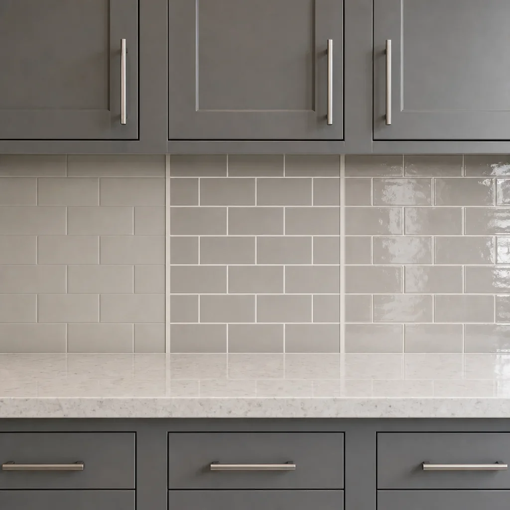
Grout colour can make the same tile look quiet or graphic. Blend grout keeps the backsplash soft and continuous, while contrast grout outlines every tile and makes the pattern more visible.
White grout looks clean at first, but it shows discolouration more easily than mid-tone grout in splash areas. For many kitchens, light gray or greige grout gives a softer look with more day-to-day forgiveness.
Light gray grout is one of the safest choices with gray cabinets. It ties into the cabinet colour family without creating a hard grid, which is useful when the tile itself is already the focus.
Greige grout works especially well when the goal is warmth. It is often the best bridge between white tile, gray cabinets, and beige or wood elements in the rest of the room.
Stacked layouts feel cleaner and more modern than offset subway. Vertical stack pushes that look further, while offset keeps a more classic rhythm that still suits many renovations.
Herringbone, picket, and basketweave add personality without forcing a bold colour. If you want the best backsplash for grey kitchen cabinets to come from shape rather than shade, these patterns are a strong middle ground.
Large tile or slab reduces grout joints, which usually means less visual busyness and less grout maintenance. Tiny mosaics do the opposite, so they are not ideal when easy cleaning is a top priority.
What backsplash to avoid with gray cabinets
Avoid pairing cool gray cabinets with an overly icy backsplash if the room already lacks warmth. That combination can look sharp in a showroom but feel cold once it is installed beside stainless appliances and cool lighting.
Avoid a busy backsplash if the countertop already has strong movement. Two competing patterns make the kitchen feel less expensive, not more custom.
Avoid exact-match gray tile unless something else creates separation. Without contrast in texture, sheen, scale, or grout, a backsplash for gray cabinets can disappear into the cabinetry and make the whole kitchen feel flat.
Avoid yellow-beige tile with blue-gray cabinets. That undertone clash is one of the fastest ways to make both finishes look wrong, even if each sample looked fine on its own.
Avoid tiny mosaics if low maintenance matters to you. More joints mean more lines to wipe, more grout to maintain, and a busier visual result behind the range and sink.
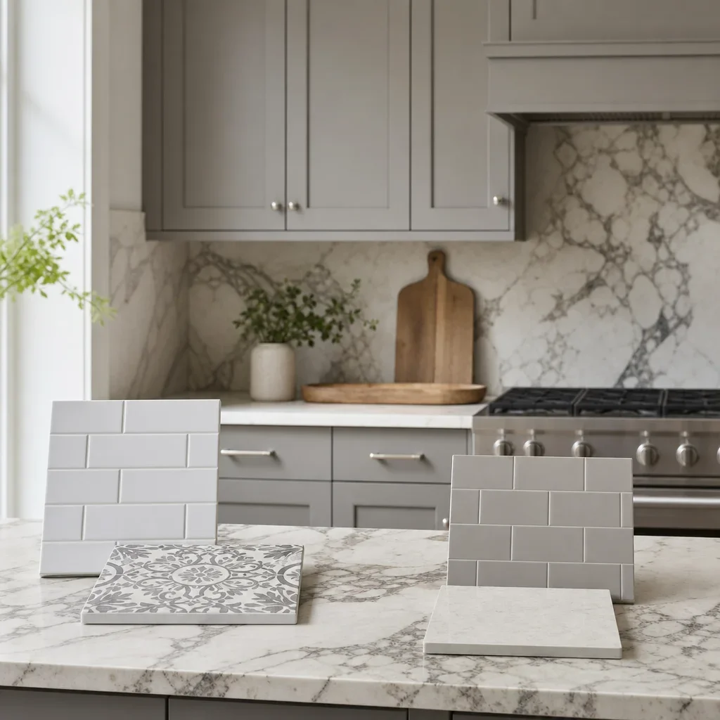
Avoid choosing from a sample wall alone. Tile undertones often shift between showroom light and home light, so any shortlist should be reviewed beside the cabinet, countertop, flooring, and hardware finishes.
Maintenance and cleaning: which backsplash materials are easiest to live with?
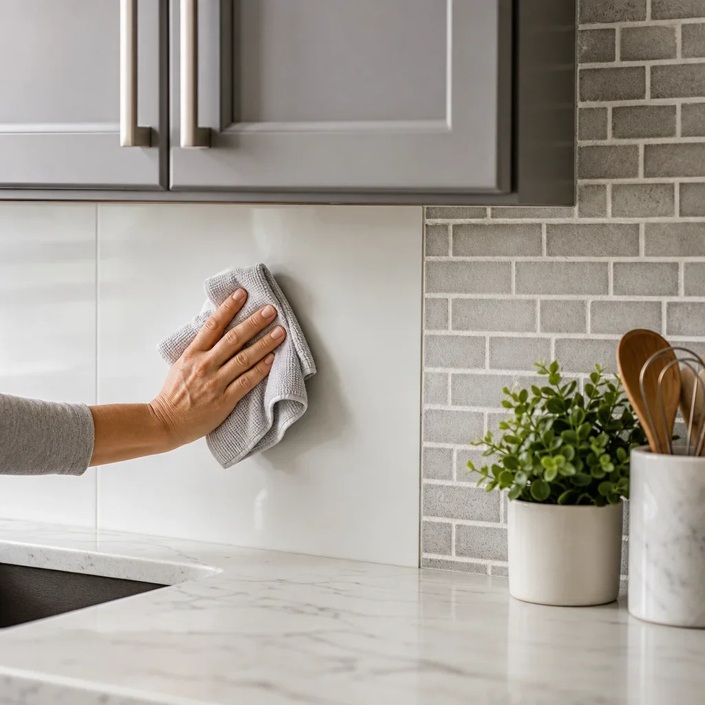
Smooth ceramic and porcelain are usually the easiest materials to maintain. They have a straightforward surface, they come in many styles, and they generally demand less care than natural stone or heavily textured tile.
Larger tiles are usually easier to wipe than mosaics because they have fewer grout lines. That matters in cooking zones where oil and splatter collect most.
Glass can clean up well, but it shows smears and reflections differently than matte tile. Some homeowners like that shine, while others prefer the quieter look of satin or matte porcelain.
Natural stone can require more product-specific care than ceramic or porcelain. Sealing needs and cleaner restrictions vary by material, so the right source for that answer is the manufacturer plus your installer.
Textured surfaces can catch more residue than flat ones. If the kitchen gets heavy daily use, a lightly varied surface is usually easier to live with than deep relief or rough clefts.
If you cook often or have a busy family kitchen, prioritize simple surfaces and restrained grout joints over novelty. A backsplash should still look good on a random Tuesday night, not just in the sample board.
Budget-friendly backsplash ideas for gray cabinets
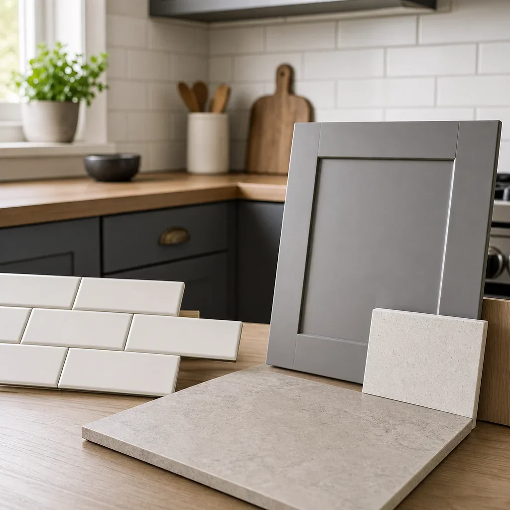
The best budget backsplash for gray cabinets is usually a simple ceramic or porcelain tile in a straightforward layout. Clean subway, stacked rectangles, and larger-format porcelain can look tailored without forcing the material budget upward.
Labour complexity affects the final price as much as tile choice in many projects. A modest tile in a simple pattern can be more cost-effective than an inexpensive tile installed in a detailed herringbone or mosaic layout.
Larger-format porcelain can be a smart value when you want a modern look with fewer grout lines. It can also mimic stone or slab aesthetics without the same material and fabrication path.
Peel-and-stick backsplash can work as a temporary cosmetic update, but it is not the same as a proper renovation finish. For a long-term kitchen remodel, it usually falls short in durability, edge detail, and how it integrates around outlets, corners, and trim.
A budget-conscious refresh still looks better when the palette is coordinated. Gray cabinets, the right white or greige tile, and a considered grout choice usually look more expensive than a trend tile chosen without regard to undertone.
Standard-height vs full-height backsplash: which looks better with gray cabinets?
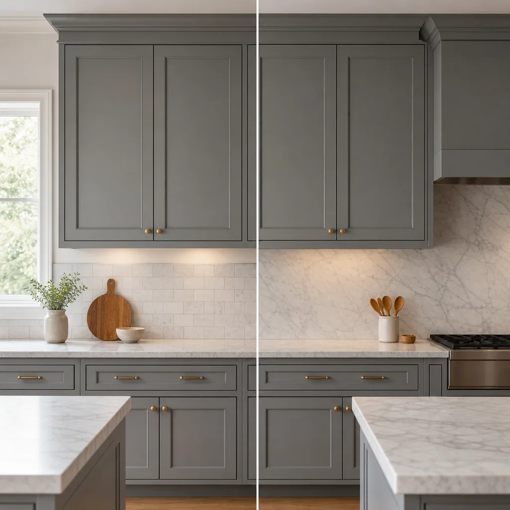
Standard-height backsplash is the typical tile run between the counter and upper cabinets. It is enough for many kitchens, especially when the goal is a clean update rather than a full visual feature wall.
Full-height backsplash runs tile or slab higher, often to the ceiling in select areas or across walls without upper cabinetry. It suits more modern kitchens, open shelving compositions, and statement stone or large-format tile.
Gray cabinets often look more elevated with full-height treatment when the design is minimal. This is especially true with slab-look porcelain, stacked tile, or a calm handmade finish that benefits from a bigger uninterrupted field.
Standard height is usually enough when the tile already has movement or pattern. In that case, stopping at the uppers keeps the design from taking over the room and can help contain the budget.
If you are choosing between the two, let the architecture decide. Minimal uppers, a striking hood wall, or open shelves often support full height, while a busier traditional layout often looks better with a standard run.
Modern, timeless, and bold backsplash styles for gray cabinets
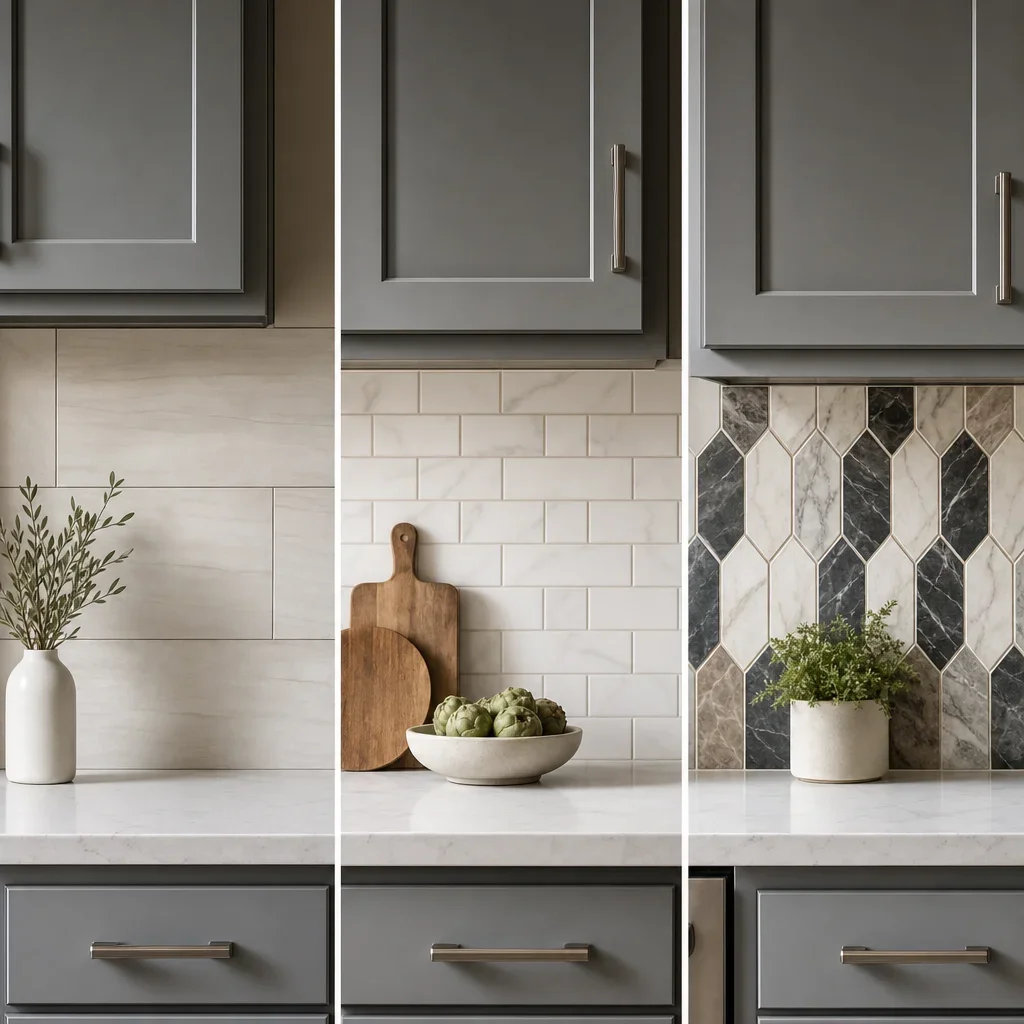
A modern backsplash for gray kitchen cabinets usually uses cleaner geometry and quieter grout contrast. Think stacked tile, slab-style surfaces, larger formats, satin finishes, or a monochrome look with texture doing most of the work.
A timeless backsplash for gray cabinets usually stays lighter than the cabinetry and avoids overworked pattern. Warm white subway, marble-look tile, and soft stone-look porcelain are common choices because they age well visually across many cabinet and hardware updates.
A bold backsplash can work beautifully with gray cabinets because gray acts like a neutral frame. Geometric shapes, stronger veining, handmade colour variation, or a deeper feature wall can all work if the counter stays quieter.
Light gray cabinets usually support a wider range of bold shapes than charcoal cabinets do. Darker cabinetry already carries more visual weight, so it often looks best with either a lighter statement or a very disciplined tonal composition.
Kitchen backsplash trends for 2026: what to know without chasing fads
The direction shaping 2026 backsplash conversations is warmer and more layered, not anti-gray. Homeowners are gravitating toward organic texture, stone looks, softer whites, fuller-height applications, and colour used with more restraint.
Gray is not disappearing so much as shifting away from icy pairings. The kitchens that feel fresher usually mix gray with warmth through greige, wood, creamy whites, or more tactile finishes.
Trend headlines are less useful than fixed elements in the room. Cabinets, counters, flooring, and light exposure last longer than a single season of inspiration images, so the smarter choice is a backsplash that supports those permanent finishes.
If you like trends, borrow them through shape or texture more than loud colour. That gives the kitchen a current look without locking the whole renovation to a short-lived palette idea.
Designer tips for choosing the right backsplash in a real renovation
View tile samples beside the actual cabinet door, countertop sample, and flooring before you decide. Undertones that seem subtle on a sample board often become obvious once all the finishes sit together in one room.
Check samples in daylight and evening light. The same backsplash for grey cabinets can read creamy at noon and cooler at night, which is why lighting should be part of the decision, not an afterthought.
Narrow the shortlist to 2 to 3 serious options before making the final call. That is usually enough variation to compare tone, texture, and grout direction clearly without turning the process into guesswork.
Choose the backsplash as part of the full kitchen composition, not in isolation. The best results come when cabinets, countertops, hardware, lighting, and wall tile are selected as one coordinated palette from concept to completion.
Project imagery to compare before you choose
Use inspiration photos in groups rather than one-offs. A useful gallery set includes light gray cabinets with warm white tile, charcoal cabinets with creamy slab-look porcelain, blue-gray cabinets with handmade gloss tile, and gray cabinets with wood counters and a soft greige backsplash.
If you are planning a larger kitchen renovation in Toronto, save images that show the full composition instead of cropped backsplash shots. The tile can only be judged properly once you see the hood, counter edge, floor tone, and hardware together.
FAQ
What backsplash goes with gray cabinets?
Warm white, soft greige, marble-look, and subtle stone-look tile are the most reliable options. The right choice depends on cabinet undertone, countertop pattern, natural light, and whether you want a crisp, warm, or more dramatic result.
Should backsplash be lighter or darker than gray cabinets?
Lighter is usually the safer direction. Darker can work in large, bright kitchens or dramatic designs, but most gray kitchens benefit from a backsplash that creates separation and reflects more light.
What color backsplash works with light gray cabinets?
Warm white, off-white, pale greige, and restrained marble-look tile usually work best. Light gray cabinets can also handle more decorative shapes because they carry less visual weight than dark gray or charcoal.
What backsplash works with dark gray cabinets?
Off-white, creamy white, soft stone-look, and subtle marble-look tile usually work best. These options keep the wall lighter and prevent the kitchen from feeling too heavy.
What backsplash works with gray cabinets and white countertops?
Soft white, warm white, low-contrast marble-look, and pale greige are strong options. If the countertop is plain white quartz, the backsplash can usually carry more texture than if the counter already has veining.
What backsplash works with gray cabinets and black countertops?
A lighter backsplash is usually the better move. Warm white or soft stone-look tile helps balance the darker counter and keeps the kitchen from reading too dark overall.
How do I make a gray kitchen feel warmer?
Use warmer whites, greige tile, wood accents, layered lighting, and warmer metal finishes. Texture also helps, especially handmade-look or stone-look surfaces that add depth without forcing bold colour.
What grout color looks best with gray cabinets?
Light gray and greige are the safest grout colours for most gray kitchens. White grout can look sharper but usually shows wear more easily, while darker grout creates a stronger graphic grid.
What backsplash should I avoid with gray cabinets?
Avoid icy white with cool gray in a dark room, busy tile with busy countertops, exact-match gray with no texture, and undertones that fight the cabinet colour. Tiny mosaics are also less ideal if low maintenance matters.
Is a white backsplash too cold with gray cabinets?
It can be, but not always. A white backsplash with gray cabinets looks balanced when the white is warm enough for the cabinet undertone or when wood, brass, warmer lighting, or natural texture adds warmth elsewhere.
Is peel and stick backsplash worth it for gray kitchen cabinets?
It can make sense as a temporary refresh, but it is not equivalent to a finished renovation surface. For a long-term kitchen remodel, proper tile or slab usually gives a better fit, edge detail, and lifespan.
Should I do a full-height backsplash with gray cabinets?
Full height usually looks better in more modern or minimal kitchens, especially with open shelving or statement materials. Standard height is still a strong choice for traditional layouts, busier tile, or more budget-conscious updates.
If you are narrowing down a backsplash for gray cabinets and want the full palette to work together, a design consultation can help turn separate samples into one clear kitchen plan. In a full renovation, the best results come from selecting cabinets, countertops, backsplash, lighting, and hardware as one composition rather than making each choice on its own.


