

A light backsplash is not automatically the safe choice. The right one works because it fits your cabinets, countertop, light, and how much upkeep you will actually tolerate. These light backsplash ideas are meant to help you choose, not just scroll.
Light backsplash ideas at a glance: how to choose the right one
A light backsplash usually means white, off-white, cream, beige, greige, light gray, pale blue, or soft green tile used as a low-to-mid contrast surface behind the counter. That palette stays popular because it can make a kitchen read brighter and calmer without forcing a stark all-white look.
The fastest way to narrow light colored backsplash ideas is to sort by four variables: cabinet colour, countertop movement, room brightness, and maintenance tolerance. If your cabinets are white, texture and grout usually matter more than colour shift. If your cabinets are dark, a lighter and slightly more reflective surface can balance the room. If your countertop has strong veining, the backsplash should usually simplify. If the countertop is plain, the backsplash can carry more pattern or shape.
A practical chooser saves time. White cabinets with white quartz usually benefit from handmade texture, stacked layout, or slightly warmer undertones. Dark cabinets with light counters usually benefit from a brighter field tile that bridges the contrast. Busy stone counters usually pair best with quiet rectangular or slab-style tile. Plain counters can handle herringbone, vertical stack, or a more tactile finish.
Should a backsplash be lighter or darker than the countertop or cabinets?
A backsplash can be lighter or darker than the countertop, but the better choice depends on whether you want continuity, contrast, or a calmer visual field. A close match usually feels more seamless and high-end. A darker or lighter contrast usually adds more definition. Neither is automatically right.
Pattern should lead the decision. If the countertop has heavy veining or speckling, a simpler backsplash keeps the kitchen from looking crowded. If the countertop is solid or lightly patterned, the backsplash can bring shape, grout definition, or tone variation.
Cabinets should be judged separately from counters. A backsplash that is slightly lighter than dark cabinets often helps the kitchen feel more open. With white cabinets, the difference between tile finish, edge detail, and grout line is often more visible than a small colour shift.
Some pairings are easier than others. White cabinets with white quartz often work best with warm white zellige-look tile, soft gray grout, or a stacked layout that adds depth. A backsplash for dark cabinets and white countertops often looks strongest in warm white, pale greige, or lightly reflective glass or ceramic that softens the jump from dark to light. Wood cabinets with warm stone counters usually want cream, sand, or beige-based tile. Greige kitchens usually work best when the backsplash stays in the same undertone family instead of flipping from warm to icy cool.
Best light backsplash colors by kitchen style and cabinet pairing
White works because it is flexible, not because it is neutral in every room. A crisp white tile feels cleaner and sharper beside cool quartz, black accents, and flatter cabinet finishes. A softer white or ivory tile feels more natural beside oak, brass, warmer paint, and stone with creamy undertones.
Off-white and cream are the easiest light colored kitchen backsplash ideas when bright white feels too stark. They soften contrast, suit warmer homes, and tend to pair well with wood, taupe, greige, and warmer marble-look counters. They are especially useful in kitchens where floors already carry beige or honey tones.
Light gray is a softer alternative to pure white when the kitchen leans cool or contemporary. It pairs well with white cabinets, charcoal accents, stainless steel, and quieter quartz patterns. The risk is not the colour itself. The risk is choosing a flat gray that fights warmer floors or creamy cabinets.
Greige, beige, and sand tones work best when the goal is warmth without obvious yellow. These shades usually pair well with white oak, mushroom cabinetry, taupe walls, and warmer countertop patterns. They also age more gently in homes where the rest of the palette is already warm and layered.
Pale blue keeps the backsplash light while adding more personality than white or gray. It suits coastal, transitional, and some modern kitchens, especially with white cabinets, light oak, and softer white counters. The most successful versions are usually muted rather than saturated.
Soft green does the same job from a warmer direction. Sage, celadon, and dusty green can feel calm, tailored, and current without reading trendy for its own sake. They usually work well with off-white cabinets, natural wood, brushed brass, and creamier counters.
Light backsplash ideas with white cabinets usually improve when the tile adds some second layer of interest. That can be surface variation, a handmade edge, vertical stack, slightly darker grout, or a finish that catches light differently through the day. A modern backsplash for white cabinets often depends more on restraint and detail than on colour itself.
Warm vs cool light backsplashes: which undertone works best?
Undertone is what makes a backsplash look intentional or slightly off. Warm light tones include cream, ivory, sand, beige, and warm greige. Cool light tones include bright white, blue-gray, pale blue, and marble-look finishes with cooler veining.
Fixed elements should drive the undertone choice. If your floor, wood cabinetry, brass, or countertop base read warm, the backsplash should usually stay warm or neutral-warm. If your cabinets, counters, paint, and hardware skew cool, the backsplash should usually stay cool or neutral-cool.
Clashes usually happen when one surface is creamy and the next is stark. A warm ivory tile beside a crisp cool-white quartz can look accidental unless another element bridges them, such as warmer walls, mixed metals, or wood. The same problem shows up when an icy gray tile sits beside honey oak or beige stone.
A sample review checklist prevents most mistakes. Compare the tile beside cabinet and counter samples at the same time. Check it in daylight and evening light. Include grout in the comparison. Hold it near flooring and metal finishes. If one sample suddenly looks yellow, pink, blue, or green beside the others, the undertone mismatch is real.
Best backsplash materials for a light kitchen backsplash
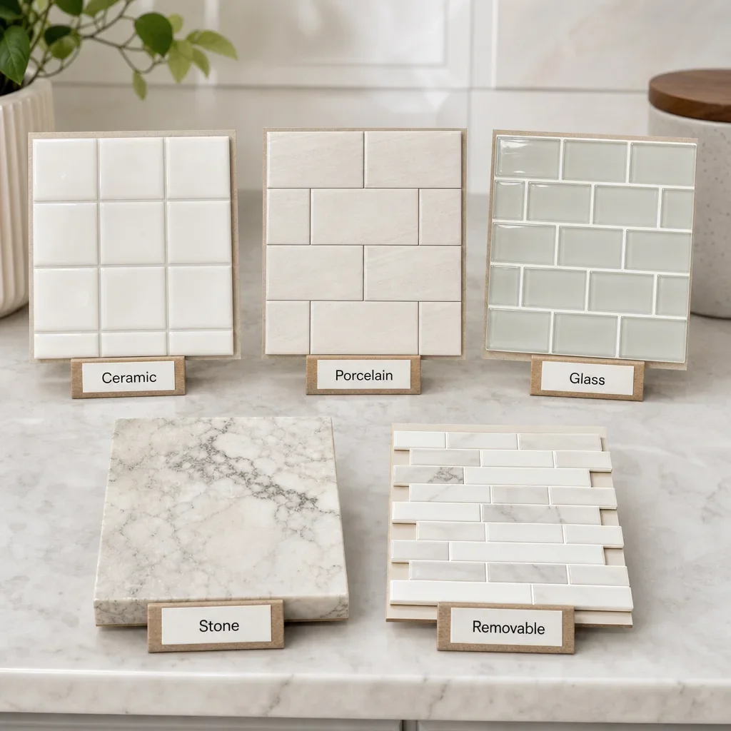
Ceramic is one of the easiest starting points because it balances looks, availability, and upkeep. It comes in a wide range of colours, gloss levels, and shapes, and it suits everything from simple subway layouts to more handmade-looking surfaces. Its weak point is not style. It is that lower-end options can sometimes look flat if the rest of the kitchen is more premium.
Porcelain is a strong practical choice when you want crisp edges, durability, and more control over finish and pattern. It often works well for modern kitchen backsplash ideas, stone looks, and large-format tile because it is consistent and less porous than many natural materials.
Glass works well when the kitchen is dark and needs more bounce. Its reflective surface can help light move around the room, and pale glass tones can read especially clean with darker cabinets. The trade-off is that installation and wall prep usually matter more because reflection can reveal imperfections.
Marble and other natural stone look premium because they carry natural depth and variation. They also ask for more care than ceramic or porcelain, especially in kitchens where splatter, staining, and acidic residue are common concerns. Sealing and maintenance requirements depend on the stone and finish, so that detail should be confirmed before final selection.
Peel-and-stick light colored backsplash ideas can make sense for renters, short-term cosmetic updates, or low-commitment testing. They are not the same as a permanent tile installation, and the finish quality, edge detailing, and long-term durability are usually more limited. They are best treated as a temporary design layer, not a renovation-grade substitute.
Material comparison table
| Material | Look | Maintenance | Cleaning | Installation difficulty | Budget position |
|---|---|---|---|---|---|
| Ceramic | Versatile, classic, handmade or clean-lined | Low to medium | Easy | Low to medium | Budget to mid-range |
| Porcelain | Crisp, durable, modern or stone-look | Low | Easy | Medium | Mid-range |
| Glass | Reflective, bright, sleek | Low to medium | Easy on surface, grout still matters | Medium to high | Mid-range to premium |
| Marble / natural stone | Organic, high-end, varied | Medium to high | More care required | Medium to high | Premium |
| Peel-and-stick / removable | Temporary, budget refresh | Medium | Medium | Low | Budget |
Tile shapes, patterns, and layouts that keep a light backsplash interesting
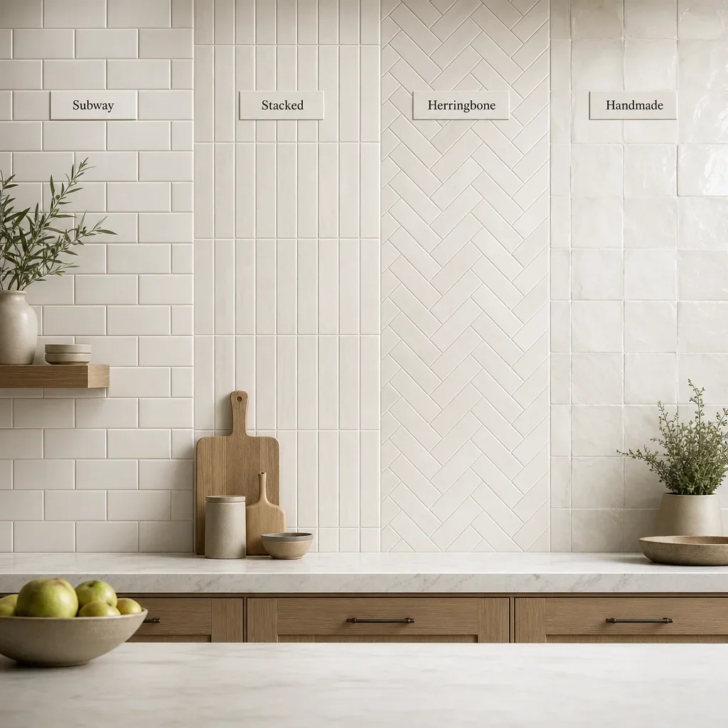
A light backsplash stops looking boring when the interest comes from shape, layout, texture, or grout instead of loud colour. Subway tile stays useful because it can shift from classic to current based on proportion and install pattern. A standard running bond feels familiar. A stacked layout feels cleaner and more architectural. A vertical stack can make the wall feel taller.
Zellige-look and handmade-look tiles add movement through surface variation and uneven sheen. That is why light kitchen backsplash ideas often feel richer in person than they do in a flat sample board. The colour may be simple, but the surface is not.
Herringbone, picket, hexagon, penny round, mosaic, and scallop tiles can all work in light palettes when the rest of the kitchen stays controlled. Smaller and more intricate shapes create more grout lines, more visual texture, and usually a busier read. That can be beautiful, but it should be balanced with simpler counters and calmer cabinetry.
Current kitchen backsplash ideas 2026 are best treated as design directions, not guarantees. Full-height runs, tile carried behind open shelving, textured surfaces, handmade looks, and quieter natural colours are all visible right now. The safer takeaway is that material honesty and thoughtful detailing tend to last longer than novelty.
Some looks date faster because they fight too hard for attention. Overly busy mosaics beside busy counters, highly specific novelty shapes used wall-to-wall, and trend colours with no connection to the rest of the home are harder to live with over time. A light backsplash usually ages better when the drama comes from detail, not from visual noise.
Matte vs glossy finishes for light backsplash tile
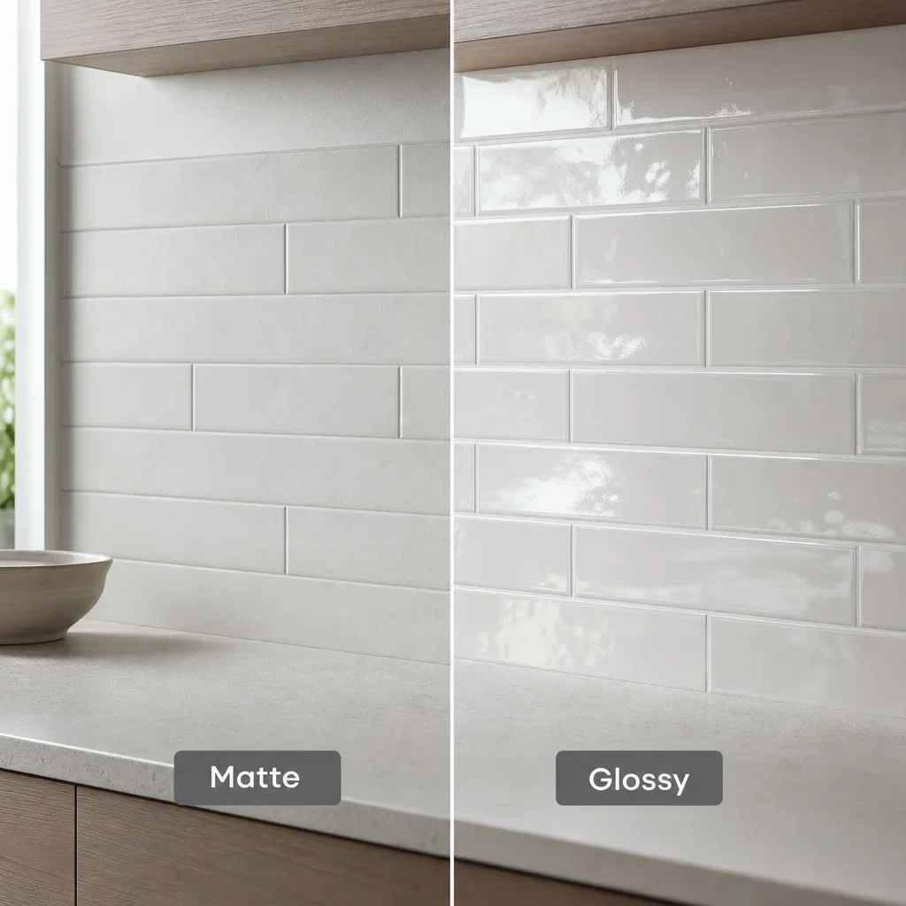
Glossy tile reflects more light, so it usually helps a darker kitchen feel brighter. It also tends to read crisper and a bit more polished, which suits transitional and many contemporary kitchens.
Matte tile feels softer and often more architectural. It works especially well in minimalist spaces, warmer palettes, and kitchens where the cabinets or counters already have some sheen and do not need another reflective layer.
The better finish depends on the room, not just the style photo. Gloss can highlight uneven walls and show smudges differently depending on colour and lighting. Matte can hide glare but may hold onto texture and grease more visibly depending on the tile surface. Comparing the finish with cabinet sheen and countertop polish usually gives the clearest answer.
How grout color changes the look of a light backsplash
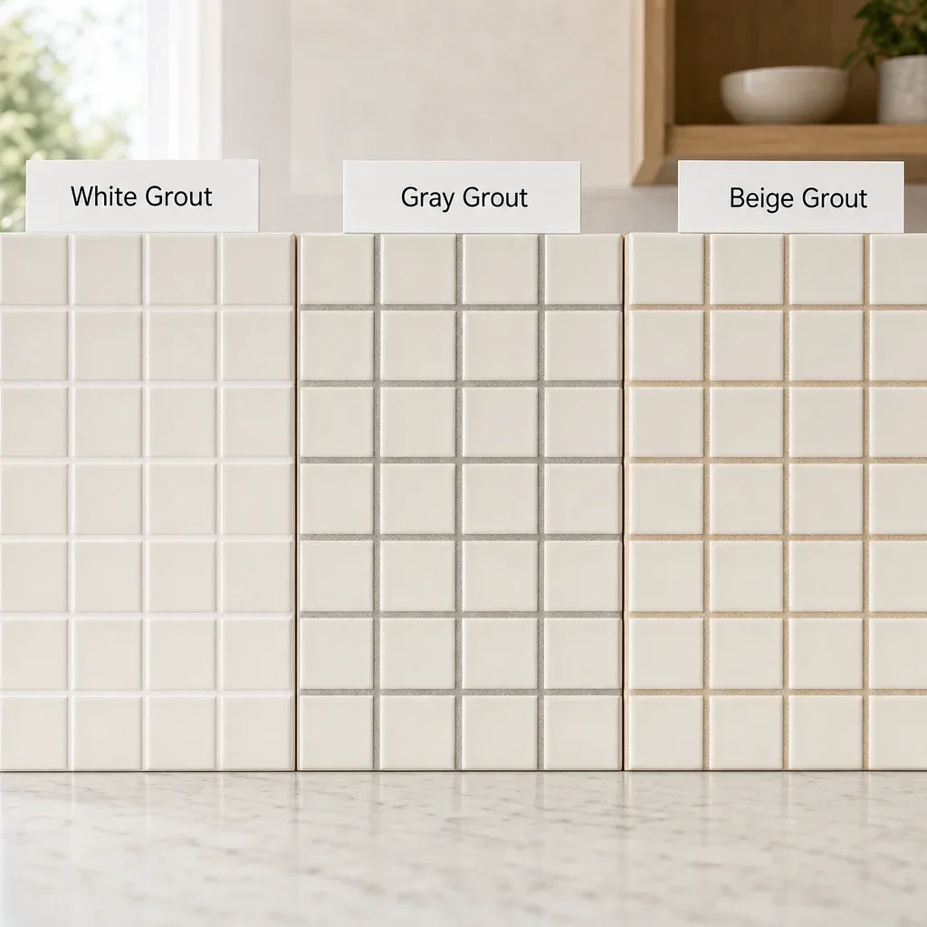
Grout can make the same tile look minimal, traditional, or graphic. A close grout match creates a more seamless field and lets the colour of the tile lead. A slightly darker grout defines the shape without making the wall feel busy. A strong contrast turns the pattern into a feature.
White tile with white grout gives a quieter and more continuous look. White tile with soft gray or greige grout gives more line and depth. Cream tile with beige grout keeps the result soft and warm. These are small shifts, but they change the whole read of the wall.
Maintenance matters here too. Bright white grout can look crisp, but active kitchens tend to show more wear at the grout line than on the tile face. That does not make it wrong. It just means grout choice should be reviewed as a maintenance decision, not only a colour decision.
Sample boards should include grout, not tile alone. A backsplash almost never looks the same after the grout line is added, especially in smaller formats, textured surfaces, or high-contrast layouts.
Light backsplash ideas for white cabinets, dark cabinets, and small kitchens
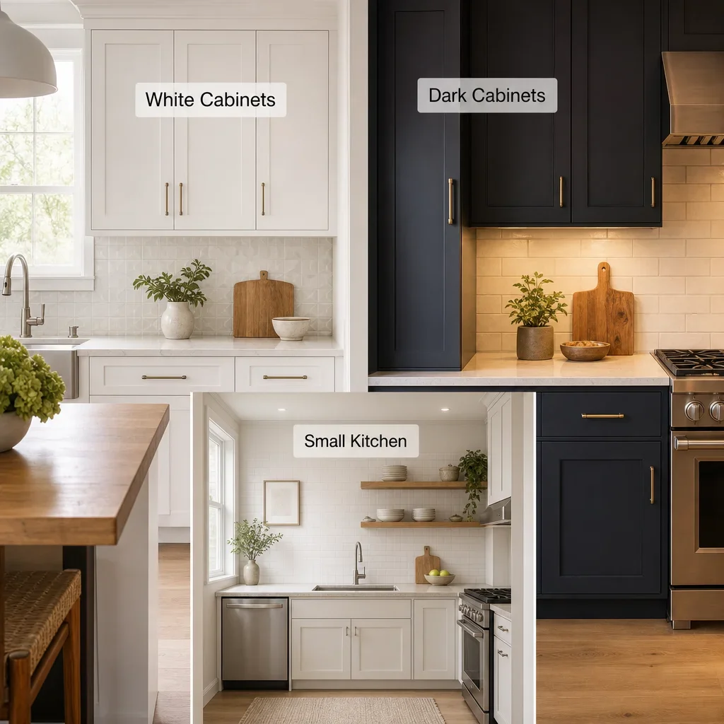
White cabinets need separation somewhere, or the room can go flat. The easiest ways to add it are texture, warm undertones, a handmade finish, stacked layout, or grout contrast. That is usually more effective than trying to create drama with a slightly different white.
A backsplash for dark cabinets and white countertops works best when it bridges the contrast instead of competing with it. Warm white, pale greige, soft gray, and lightly reflective tile often do that well. The goal is usually to keep the middle layer bright enough to connect the dark base and the lighter top.
Small kitchen backsplash ideas should reduce visual clutter, not remove character. Lighter tones, simpler layouts, and fewer competing finishes usually make a compact kitchen feel calmer and more open. Gloss or semi-gloss can help if the room lacks natural light, but too many tiny shapes can make a small wall feel busy.
A dark kitchen with limited daylight usually benefits from a pale backsplash with some reflectivity and good under-cabinet lighting. The tile does not need to be shiny mirror-bright. It just needs enough light return and enough tonal lift to keep the wall from disappearing.
Open shelving changes the decision because more of the backsplash stays visible. Carrying tile higher on the wall or to the ceiling can look more finished, especially when the tile is calm enough to support dishes, art, or decor without visual conflict.
Timeless backsplash choices vs trends to avoid
Timeless backsplashes usually share four traits: simple shapes, balanced colour, quality material, and a relationship to the architecture of the home. That is why subway tile, soft stone-look porcelain, restrained mosaics, slab backsplashes, warm whites, and gentle greiges keep showing up in kitchens that age well.
Trends are not the problem. Mismatch is the problem. A backsplash starts to feel dated faster when it clashes with the countertop, ignores the home’s broader palette, or relies on a very specific look that the owner never truly liked in the first place.
What backsplash to avoid depends on the kitchen, but a few patterns are consistent. Busy mosaics plus busy counters usually compete. Strongly trendy colours with no supporting finishes often feel disconnected. High-maintenance surfaces chosen without understanding the upkeep can become frustrating quickly.
Outdated tile colours are context-driven, not universal. Some icy grays can feel flat in warmer homes. Some beige-heavy combinations can feel stuck in an older palette if the counters, paint, and flooring were never updated. The answer is not to ban a colour. The answer is to judge it against the whole room.
Maintenance, cost, and installation difficulty comparison
The lowest-maintenance light backsplash options are usually ceramic and porcelain with a practical grout choice. They are widely available, easier to clean than many textured natural stones, and flexible enough for both classic and modern layouts.
Natural stone usually sits at the more care-intensive end because porosity, surface finish, and sealing needs can make daily upkeep more involved. That does not make it a bad choice. It makes it a better fit for homeowners who value the material enough to accept the maintenance.
Installation gets harder as the layout gets fussier. Smaller tiles, more cuts, outlet interruptions, pattern matching, vertical transitions, niche details, and full-height runs all increase complexity. Large-format pieces can reduce grout lines, but they also demand straighter walls and cleaner planning.
Budget should be judged by the full combination, not just the tile itself. A simple ceramic tile in a labour-heavy pattern can cost more overall than a cleaner porcelain in a straightforward layout. The cheapest-looking result is often not the least expensive material. It is the wrong finish, wrong grout, or wrong scale for the kitchen.
Before you buy: sample, measure, and avoid common backsplash mistakes
The best backsplash decisions happen with real samples at home. Put cabinet, countertop, flooring, paint, and tile together in the same light. View them in daylight and at night. Include grout in the test. Hold the tile near hardware and faucet finishes. This step catches more problems than any showroom wall can.
Common mistakes are predictable. Choosing tile before the countertop locks in the wrong relationship. Mixing warm and cool undertones creates tension. Layering too many patterns makes the kitchen feel crowded. Ignoring grout leads to surprise after install. Choosing a porous stone without understanding care leads to regret.
Measurements should stay simple at the planning stage. Count the wall areas that will actually receive tile, note windows, outlets, hood details, and open-shelf zones, and let the installer or renovation team confirm final site measurements before ordering. If tile is being ordered, an overage allowance of 10% to 15% is a common planning range, but the right amount depends on cuts, pattern complexity, and whether the tile may be discontinued.
Termination points matter more than homeowners expect. Decide where the tile starts and stops, how it ends at cabinet sides, whether it runs to the ceiling, and how it meets the hood or side wall. Those details are what make light backsplash ideas look finished instead of generic.
If you are planning a kitchen renovation in Toronto or the GTA, this is the point where a design consultation can save real backtracking. Coordinating tile, cabinetry, counters, lighting, and wall colour together is usually easier than trying to fix one mismatch after another.
When a custom kitchen renovation makes backsplash decisions easier
Backsplash choices get easier when the whole kitchen is being designed as one system. Cabinet colour, countertop movement, hood design, wall paint, under-cabinet lighting, and flooring all affect whether a tile feels warm, flat, bright, calm, or busy.
That is why full-service planning usually produces better sample decisions than choosing tile in isolation. When the layout, millwork, counters, and finish palette are reviewed together, it becomes much easier to see whether a backsplash should disappear slightly, add texture, or act as a quiet focal point.
For homeowners comparing similar-looking samples, concept-to-completion support can narrow the choice faster. It helps with pairings, grout review, edge details, and the small finish decisions that make a kitchen feel resolved. For related planning, a kitchen renovation Toronto or home renovation Toronto project usually benefits from looking at the backsplash late enough to reflect the countertop selection, but early enough to coordinate every finish around it.
FAQ
Should your backsplash be lighter or darker than a countertop?
Either can work. A lighter backsplash usually keeps the room brighter, while a darker one adds more contrast. The better choice depends on whether the countertop is busy or quiet and whether you want the backsplash to recede or stand out.
What is the new trend in backsplash?
Current directions include full-height runs, more texture, handmade-looking surfaces, quieter natural colours, and layouts that feel cleaner and less fussy. Those are observations, not rules.
What is the trend in kitchen backsplash 2026?
The safer read for kitchen backsplash ideas 2026 is continued interest in warm neutrals, tactile surfaces, thoughtful grout choices, and backsplash installations that feel integrated with the full kitchen design.
What backsplash will never go out of style?
Simple shapes, balanced colours, and materials that suit the architecture of the home last the longest. Subway tile, soft stone-look porcelain, slab backsplashes, and warm whites or greiges are dependable examples.
What backsplash to avoid?
Avoid combinations that fight the countertop, novelty shapes used too aggressively, and high-maintenance materials chosen without understanding the upkeep. The issue is usually mismatch, not one banned style.
What is the most popular backsplash right now?
Light, calm, and textured backsplashes remain widely used because they work with many cabinet colours and countertop styles. White and off-white are still common, but warmer and more tactile versions tend to feel more finished than flat bright white alone.
Should a kitchen backsplash be lighter or darker than cabinets?
With dark cabinets, a lighter backsplash often keeps the room more open. With white cabinets, finish, texture, and grout usually matter more than making the tile noticeably lighter or darker.
What is the best color for a kitchen backsplash?
There is no single best colour. The best one is the colour that matches the undertones of your cabinets, counters, floors, and light while fitting the amount of maintenance you want.
What are the outdated tile colors?
No tile colour is outdated everywhere. Some icy grays or heavy beige combinations can feel older in the wrong setting, but context matters more than the label.
Can a backsplash go all the way to the ceiling?
Yes. Full-height backsplashes can look more finished, especially behind a hood, between open shelves, or on walls with fewer interruptions.
What light backsplash works best with white cabinets?
White, warm white, soft greige, pale blue, and soft green can all work. The best result usually comes from adding texture, a thoughtful grout choice, or a layout that keeps the kitchen from feeling flat.
What light backsplash works best with dark cabinets and white countertops?
Warm white, pale greige, soft gray, or lightly reflective tile usually works well because it bridges the contrast and keeps the middle of the kitchen bright.
Is peel-and-stick backsplash a good option for renters?
It can be a reasonable temporary option for renters or short-term updates. It is best for lower-commitment refreshes, not as a direct substitute for a permanent tile installation.
The best light kitchen backsplash ideas usually look obvious only after the rest of the kitchen is considered. If you are choosing between two close options, compare the grout, undertone, and finish before you compare the photo. That is usually where the right answer shows up.


